DATE
January 2018
SOFTWARE
Sketch
SKILLS
UX/UI Audit
User Experience
User Interface
Introduction & Brief
As part of the UX/UI audit course, I redesigned the asie-online.com web platform to give it a current and rewarding brand image.
Asie Online is a travel agency specialized in tailor-made travel in Asia, for couples, families and groups. Whether it is a first discovery of Asia, an off-the-beaten track tour, a family trip, a free trip, a short stay in Asia, a honeymoon..., Asie Online, offers its experience and skills to help you organize the trip that suits you, according to the period you wish to travel, your travel habits, your desired services, and your budget. They advise and guide throughout the preparation of the tailor-made trip to Asia, through personalized exchanges. To do this, they offer a wide range of tours and stays in Asia.
The Challenge
Asie Online is a travel agency whose current website has many flaws, both UX and UI, that is why I was asked to review from the beginning to the end the creation of this site.
My Role
My role was mainly to conduct user research, evaluate the specific needs of various users, convey key ideas in initial mockups, identify the various UX/UI problems of the site and solve them.
Before I delved into my research, I set myself high quality objectives:
- Nourish a customizable experience in order to allow users to feel in control.
- Reassure the user and guide him through the whole process of creating his trip.
- Consider and build long-term value for users beyond the initial product goals.
Note about Iteration:
The project was completed over a 4-month period, including user tests, sketches, etc., in order to have a final project that was completely achieved.
The Website
Research
Not being familiar with the tourism industry, I first examined statistics on travel in Asia in order to better target users and have a first approach about this.
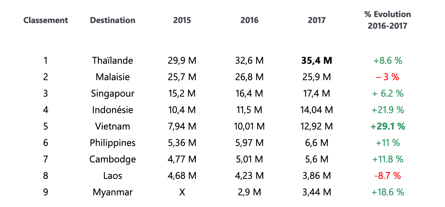
Tourism is the world's leading industry and represents nearly 1.2 billion incoming* international tourists per year in 2015. It is estimated to reach 1.8 billion by 2030...! China recorded a growth of 1.4 per cent for all incoming crossings.
South Asia was the second fastest market with 14 percent year-on-year in March this year although in terms of visitor volume, it was still far behind the other sub-regions in Asia / Pacific (860,000 arrivals for the month). With the exception
of the Maldives (which recorded a five percent decline), all reporting destinations within this sub-region significantly increased their foreign arrivals with more than ten percent for the month. Nepal and Sri Lanka, in particular, made very strong
gains in March 2012, with gains of 37 percent and 21 percent respectively. Southeast Asia became the fastest growing sub-region in Asia / Pacific during March 2012 with a 15 percent increase in international arrivals. Thailand managed to achieve
double-digit growth (up 12 percent) for the first time since September last year when floods affected international tourism.
Overall, the strong demand for travel to the sub region has contributed to a strong growth for all destinations. I wanted to better understand the tourism industry and mainly to understand it in Asia, so, after many researches, I realized that this was a very popular geographical area and that it was becoming more and more attractive.
Constat
Competitors
Today times have changed and users want a simple flow and user experience without too many constraints. The analysis of large travel agencies such as American Express or Carlson Wagonlit allowed me to emerge and better understand what users wanted.
A too complex UX
The sites have many shortcomings at first sight Ux impact on a bad user experience such as the presence of bad calorimetric contrasts, the abundance of CTA, losing the user on its different actions. The tree structure of the sites is totally to be reviewed and therefore make it easier.
The brand image
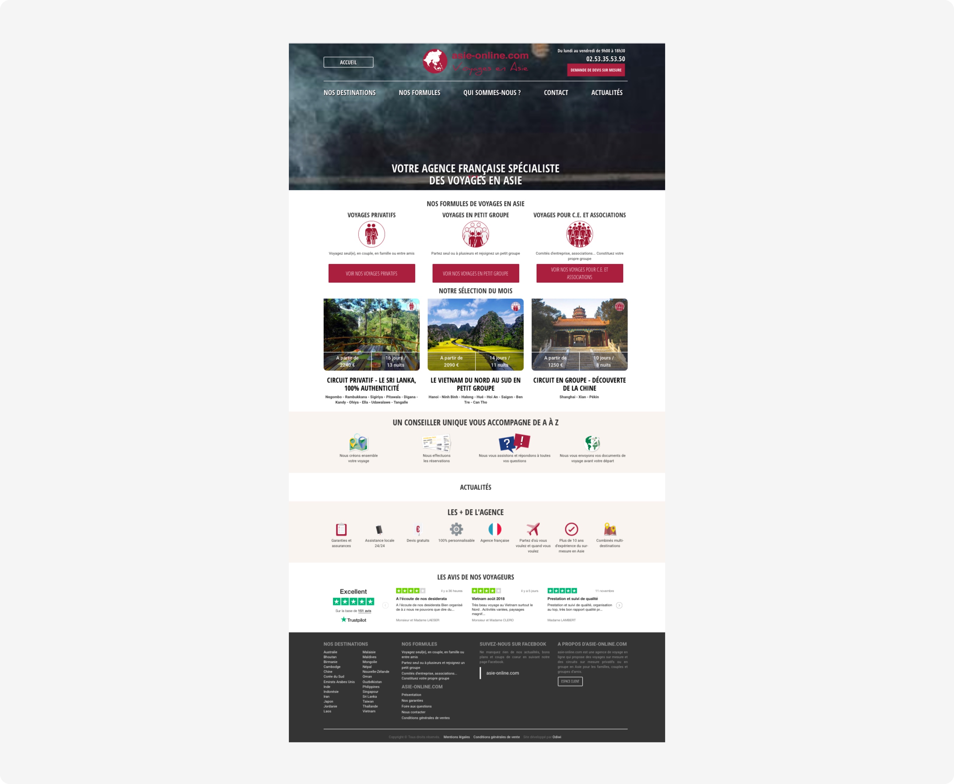
The brand image is not highlighted by a bad Ux but also by a bad Ui. The quality of the visuals is not attractive. All this gives a low cost and unprofessional image of the agency.
UX Research
I started by recreating the tree structure of the site and at each point draw what was wrong with the user experience. The observation was that there were too many complicated paths leading to the same point complicating the user experience. On the other hand, the user was lost by the abundance of call to action that was not useful in some places.
On the other hand the IU also creates many problems in colorimetric contrast temperature but also by the presence of elements that invade and lose the user.
The concept
I thought about how the homepage would be presented in such a way that it would be as attractive and qualitative as possible. The objective, however, is also to have a conductive line that allows the user to be easily guided in the design of his trip.
Wireframes
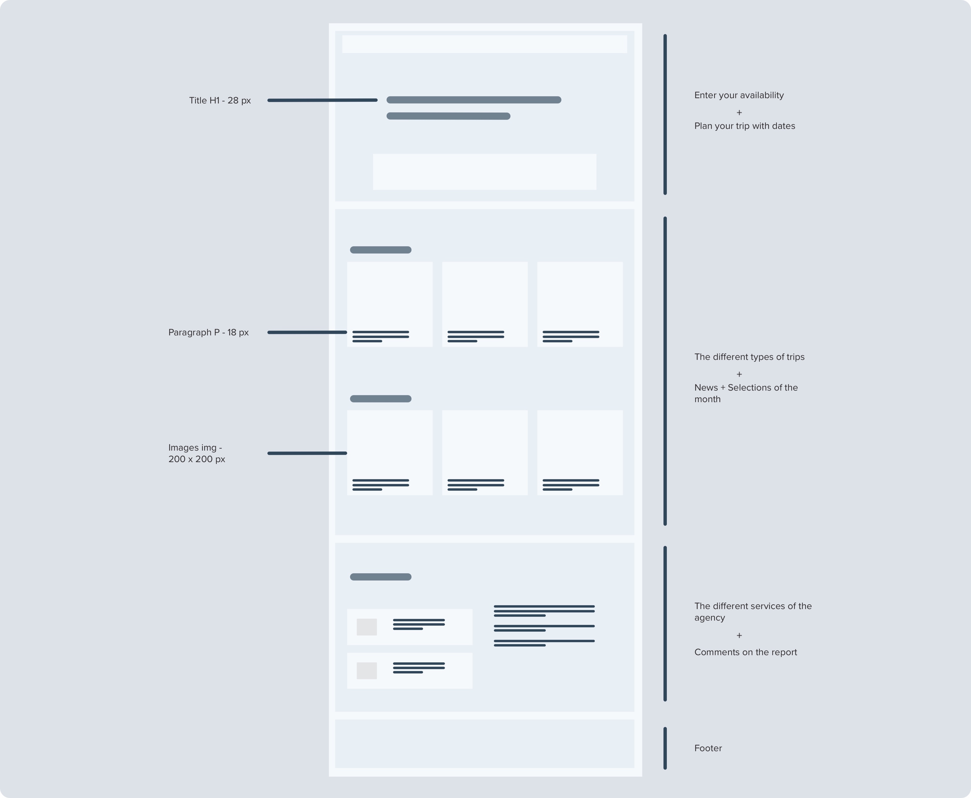
In order to better formalize and reflect on how the project was going to be developed, I decided to develop wireframes which allowed me to understand how I would organize the home page.
The main part of the work was to reorganize the home page to make it more attractive and less cluttered. I have divided it into significant sections, each of which has only one or two main calls for action.
Once one or more concepts were developed, I moved to Sketch to create the interfaces.
User testing
The presence of a test phase here was very interesting and allowed me to further develop the project.
For the test phases, we started by validating a user scenario that allowed the tester to complete all the steps relevant to the analysis and development of the functionality.
For example, for the first scenario, the user simply had to create his own personalized trip and so at each step he would say what he was doing, thinking aloud.
Final result
Home page
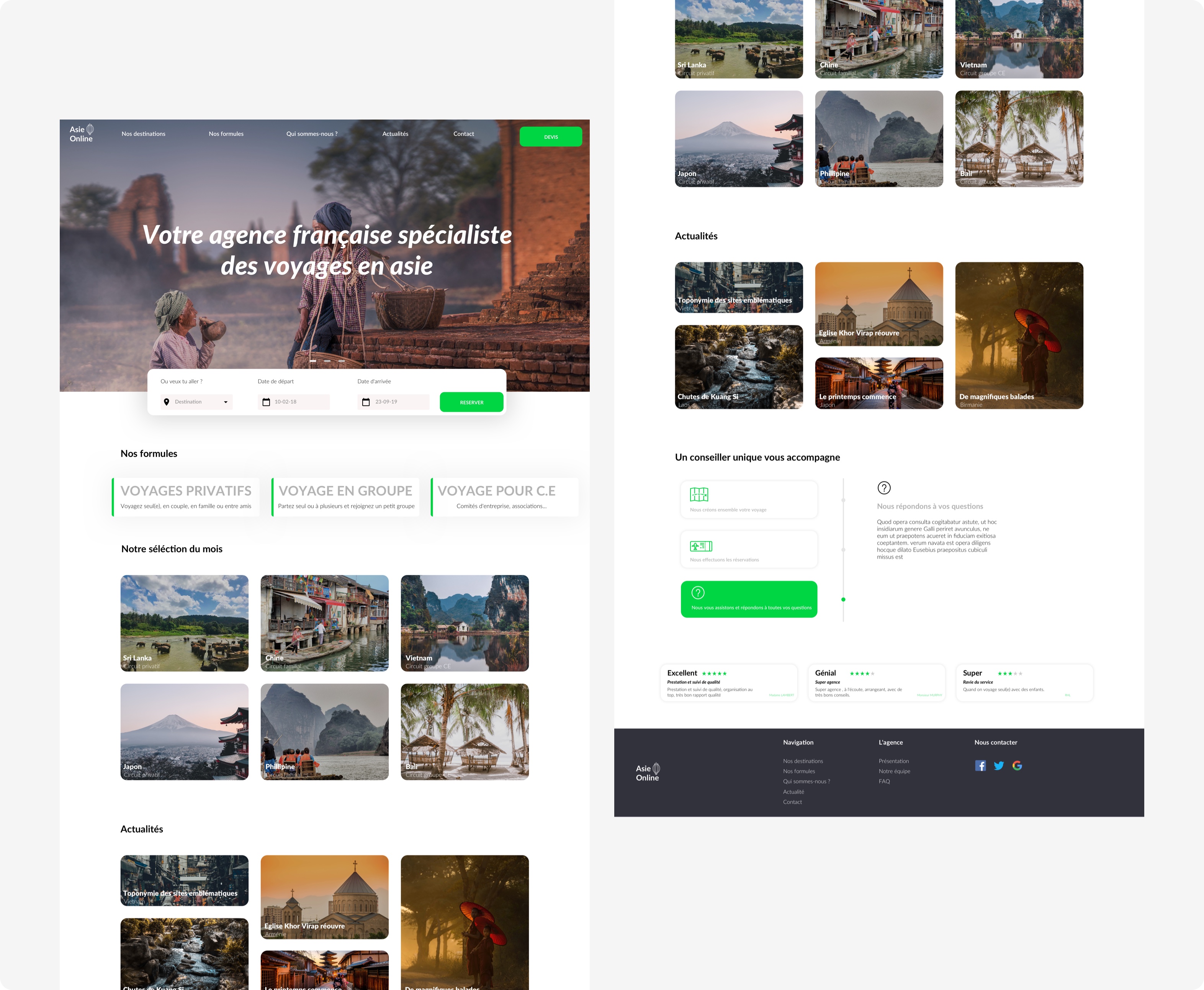
The home page needs to be both physically attractive and easy to use. The objective here was to create a homepage that "tells a story" in order to make the user travel.
Ux part
For the Ux part, thanks to the user tests carried out previously, a simple and efficient prioritization has been implemented in order to allow the user not to be overloaded with information. In addition, the Call To Action have been replaced and placed in strategic locations, allowing the site to be efficient.
So I divided the homepage into clear and simple sections so that each one has only one or two CTAs. This provides clear and easily identifiable ways to interact with the service offered by the website.
Good visual
The quality of the visuals was therefore essential to make the user want to use them. In order to ensure a better understanding for the user, a better graphic approach and a better intuitive design, I decided to use a flat design approach, with aspects of minimalism, graphics and modernity On the other hand the typography used I opted for google royalty-free fonts.
A simple but effective typographic contrast separates the titles from the text to be copied.
A more eye-catching user interface not only enhances the brand's image but also reassures the user of his or her confidence.
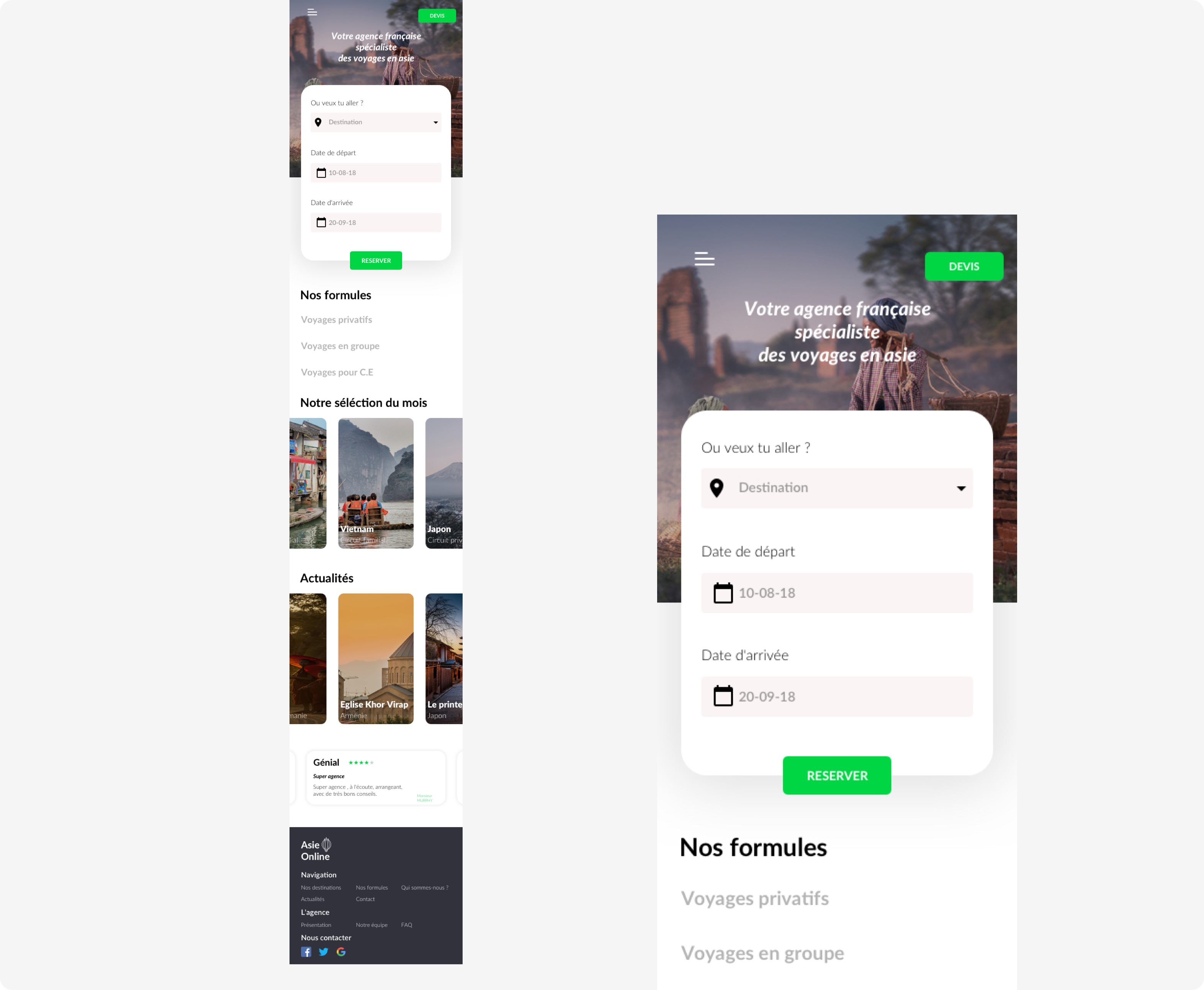
Mobile version
A mobile version was designed because more than 80% of the users of this site came from a mobile version, which is why a responsive version was designed.
Conclusion
The final result was visually satisfactory and the UX was improved compared to the old website. Moreover, this project was conducted as a real project in the sense that it was a recel test and so it taught me to think about a different user experience from other projects for a very specific audience.
Asie Online
Website redesign of a travel agency, as part of the UX/UI Audit course.